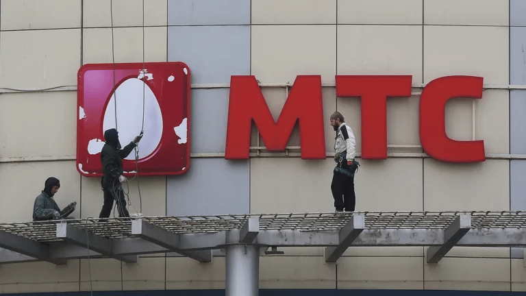

Mobile operator MTS will announce a rebranding on Thursday, March 30. The company decided to stop using the image of an egg in its logo, which since 2006 has been the main symbol of the brand. On this subject reported MTS President Vyacheslav Nikolaev in conversation with RBC.
According to him, instead of an egg, the new logo will display a red square with the letters M, T and C along the perimeter – this variation is approved for the operator’s main services. At the same time, the visual style of the company’s subsidiaries (MTS-Auto, MTS-Music, etc.) will be different: a corner will be cut off from the square, in which the service logo will be placed.
As Nikolaev explained, the decision for a full-fledged rebranding was made after MTS changed its visual style slightly in 2019. The company’s president also referred to research, according to which the vast majority of its participants associate the brand not with an egg, but with red.
“Furthermore, young people, according to MTS research, evoke an ‘association of something old-school, classic, stable’ in young people, and since the previous brand was memorable, it was the tradition that was recalled. But the company itself has changed a lot in recent years, launched new ventures and is no longer just a telecom operator,” RBC writes.
Commenting on fears about the possible departure of some customers after the logo change, Nikolaev assured that there were no “egg-lovers” at MTS. As RBC notes, the operator’s slogan – “Be better every day” – will not change.
MTS has been using the egg as its main symbol since 2006. Then the operator refused the MTS GSM inscription on a yellow background. In different colors, the egg was featured in the logos of the operator’s subsidiaries, including MGTS.
In 2019, MTS slightly amended changed from a white egg on a red background to a red egg on a white background. At the same time, the company changed its slogan: instead of “You know you can!” “Be better every day.”