
The latest redesign of YouTube Music’s Now Playing screen marks one of the platform’s most significant interface overhauls in years, reflecting a broader shift in how streaming apps prioritize usability, visual hierarchy, and engagement.
After months of testing across Android and iOS, YouTube Music has begun rolling out a split-screen, dual-pane interface that fundamentally changes how users interact with their music. The update does not simply tweak visuals. It rethinks the listening experience from the ground up.
At the center of the redesign is a new dual-pane layout that separates core playback controls from the listening queue and additional content. This split-view design allows users to simultaneously see album art, controls, and upcoming tracks, creating a more structured and intuitive interface.
The album artwork remains a focal point, but the surrounding elements have been reorganized with precision. Playback controls such as play, pause, skip, and shuffle now sit directly beneath the track information, improving accessibility and reducing visual clutter. Earlier reports also noted that this redesign relocates controls and introduces a cleaner hierarchy across the interface.
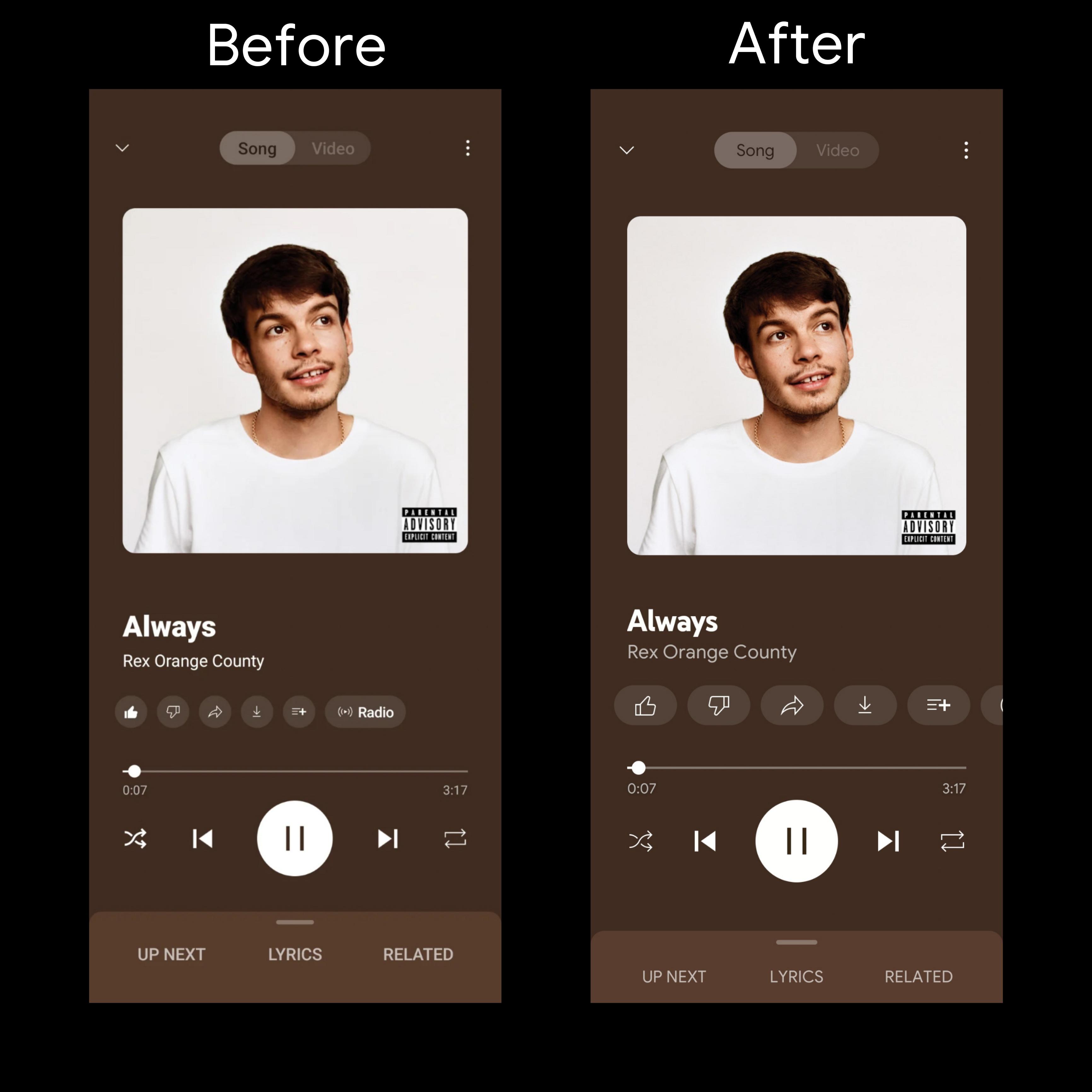
The redesign also revisits a key feature: the Song and Video switcher. Instead of removing it, YouTube Music has refined it with icon-based controls placed more prominently at the top of the interface. This ensures that users can still seamlessly toggle between audio tracks and music videos without disrupting their listening flow.
Visually, the update leans into a cleaner and more minimal aesthetic. Text elements such as song titles and artist names are more readable, spacing has improved, and buttons appear less crowded. The result is an interface that feels more polished and easier to navigate during everyday use.
Beyond aesthetics, the redesign signals YouTube Music’s broader ambitions in the competitive streaming landscape. As a service with over 100 million subscribers globally, YouTube Music continues to evolve its interface to better compete with rivals by emphasizing usability and personalization.
Importantly, this redesign is part of a larger pattern of updates across YouTube’s ecosystem. Over the past year, the company has introduced features like cross-device queue syncing and smarter recommendations, aiming to create a more seamless and connected listening experience across devices.
User reactions, however, remain mixed. While many appreciate the cleaner look and improved navigation, others are cautious about changes to familiar layouts. Interface redesigns often require users to relearn navigation patterns, and even well-executed updates can initially disrupt established habits.
Still, the direction is clear. YouTube Music is no longer relying on incremental tweaks. The new Now Playing screen represents a more ambitious shift toward redefining how users engage with music on mobile platforms.
By introducing a split-screen layout, refining playback controls, and embracing gesture-based navigation, YouTube Music is positioning itself as a more modern and competitive streaming platform. Whether users fully embrace the redesign remains to be seen, but it undoubtedly marks a turning point in the app’s evolution.