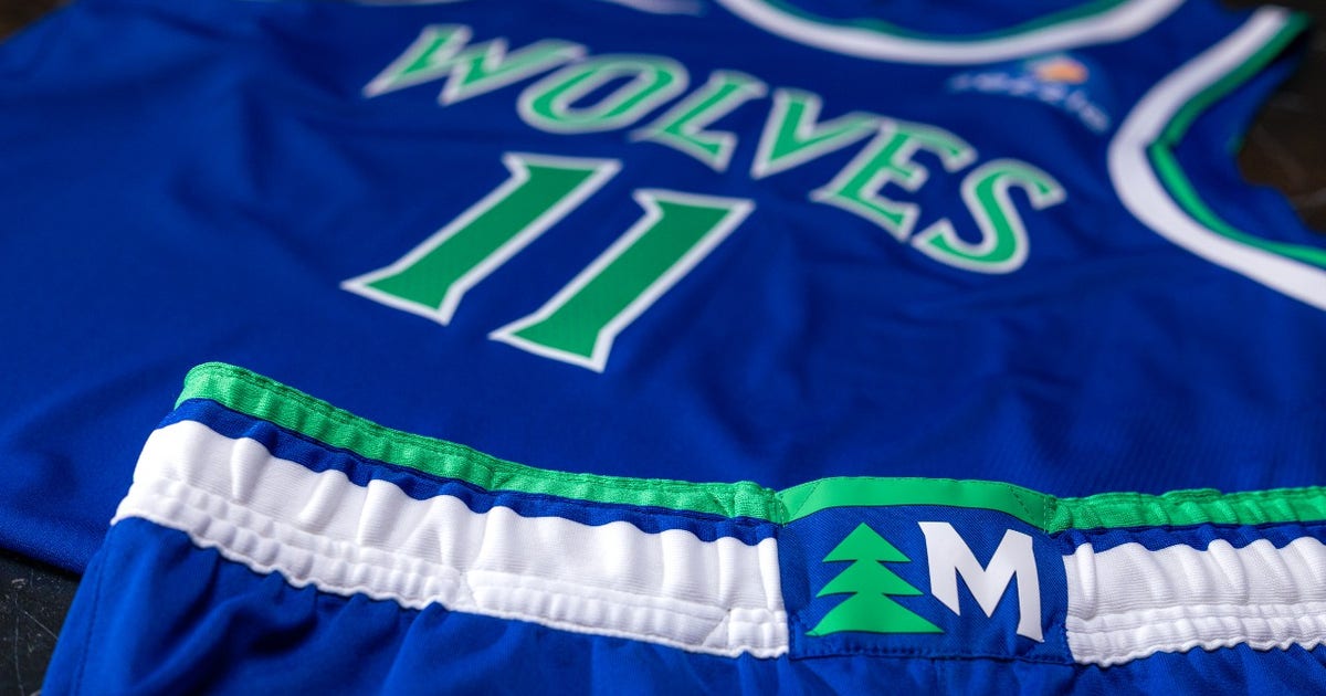

MINNEAPOLIS – The moment that framed Sunday’s reveal at Target Center was not the new logo, or the black statement jerseys with their glowing pine-tree trim. It was the belt buckle. Stitched into every uniform, on all three colorways, is a custom monogram called the “Tree-M.” Small enough to miss, deliberate enough to define the whole exercise.
The Minnesota Timberwolves officially unveiled their new logo, uniforms and court designs on Sunday, the first comprehensive rebrand the franchise has undertaken in nine years. The announcement, made in front of media and fans at Target Center, landed in the first full offseason since the team was sold for $1.5 billion last June to a group led by Alex Rodriguez and Marc Lore – both of whom appeared in the franchise’s hype video for the occasion.
“This franchise means something different to every generation of fans,” Timberwolves and Lynx CEO Matt Caldwell said in a statement. “We wanted this new look to reflect the pieces of Timberwolves basketball fans have always connected with, while also feeling true to the team and culture surrounding this franchise today. More than anything, we wanted to create something that reflects where this organization is headed and what the entire state can rally behind.”
What Caldwell described is essentially a remix rather than a reset. The primary logo retains the howling wolf looking upward in front of a basketball with the North Star above – a concept that has anchored the franchise’s identity since 2017. But pine trees now fill the background of the mark, returning an element that defined the team’s most iconic era. The color scheme reverts to the blue, green and white the Wolves wore in their inaugural 1989-90 season, before the franchise’s mid-1990s pivot toward slate blue and black.
The three uniforms follow the same logic. The white association and royal blue icon sets reintroduce that original palette, wearing “Wolves” across the chest as the franchise did in its first years – a cleaner wordmark than the full “Timberwolves” block that defined the 2017-present look. Both sets carry the “Old Shep” secondary logo on the shorts, a callback to the earliest franchise branding that will register immediately with long-tenured fans and perhaps confuse everyone else.
The statement edition is where the design work gets pointed. It revives the black-and-trees aesthetic that the franchise wore from 1996 to 2008 and that has never entirely left the cultural memory of Wolves basketball – a fact the team tested last season when it wore a black alternate for portions of the year. Fan response to the throwback alternate was overwhelming, and the new statement set formalizes that signal into the permanent look. Pine-tree trim runs along the collar, arm holes, waistband and shorts hem, now with a blue edge the franchise says is inspired by Minnesota’s lake country. The wordmark and numbers, white with blue and green outlines, drop the silver that the 1996-2008 version used.
Two details appear on every uniform regardless of colorway: the Tree-M belt buckle monogram and a lineup of five pine trees above each jock tag – described by the team as a subtle nod to the starting five on the court. Whether or not players or fans register that symbolism, both details reflect the level of specificity the Rodriguez-Lore ownership group wanted to signal in the rebrand’s first presentation.
The court redesigns carry the same aesthetic through to the floor. A core court places the updated primary logo at center, with gray lanes and pine trees flanking the blue out-of-bounds area alongside a “MINN” wordmark. The statement court goes darker – the “Wolves” wordmark at midcourt, black lanes, and a thick belt of pine trees running along black sidelines and baselines. The lane color choice separates the two most clearly: gray communicates a cleaner, more contemporary feel, while the black statement court reads as a deliberate bridge to the team’s most aggressive visual era.
The backdrop for all of it is a playoff context that remains complicated. Minnesota finished 49-33 in the 2025-26 regular season, earning the No. 6 seed in the Western Conference. After back-to-back Western Conference Finals appearances, the Wolves were eliminated by the San Antonio Spurs in the second round, a 139-109 blowout in Game 6 that made plain the distance between this team and the West’s current top tier. Victor Wembanyama and the Spurs are now in the NBA Finals against the New York Knicks.
The question the rebrand raises without answering is what Anthony Edwards and the rest of the current roster make of wearing it. The new look is built around nostalgia for eras those players never experienced, deployed in an offseason defined by the franchise’s failure to advance past the second round for the first time in three years. Edwards himself played through a knee injury in the second round before the Wolves fell to the Spurs in six games – a detail conspicuously absent from the franchise’s messaging about this new chapter. Whether the visual reconnection with the Kevin Garnett era reads as aspiration or deflection may depend entirely on how next season goes.
What the Timberwolves have not announced is a timeline for when the new uniforms and courts will go on sale or become available to season ticket holders. The team confirmed fans can register for jersey drop notifications at its website, and that the all-new merchandise collection is already live at the team store. The new look debuts with the 2026-27 season; the start date has not been confirmed by the NBA. ESPN reported that the Houston Rockets and Atlanta Hawks are also expected to unveil redesigned uniforms ahead of the 2026 NBA Draft at Barclays Center in Brooklyn on June 23-24.
For now, the trees are back. SportsLogos.Net noted that this marks the franchise’s first update to its Association and Icon Edition uniforms since the Nike takeover of NBA outfitting in 2017-18. What the new ownership does with them – and what Anthony Edwards and company can produce while wearing them – is the part the design team cannot control.